NEW YORK—Fall may have only just begun, but fashion is always looking forward. While we’re pulling out the sweaters and scarves, the fashion world is already planning for spring and summer—which means the eyewear design world is, too. And when it comes to predicting trends, there’s one authority in particular whose predictions are always eagerly anticipated: Pantone. At the end of every year, Pantone announces a Color of the Year for the coming year—2019’s is Living Coral—but they make trend predictions each season as well. Earlier this month, the company shared their color palette predictions for Spring/Summer 2020: 12 colors and four neutrals that we’ll likely be seeing everywhere next year, from clothes to frames.
The Spring/Summer 2020 Pantone colors express ease and familiarity, Pantone said. Pantone Color Institute executive director Leatrice Eiseman said, “Combining our desire for stability, creativity, and more spontaneous design approaches, the color palette for Spring/Summer 2020 infuses heritage and tradition with a colorful youthful update that creates strong multi-colored combinations as well as energizing and optimistic pairings.”
Pantone’s colors for Spring/Summer 2020 are:
Flame Scarlet (Pantone 18-1662), which Pantone said “exudes confidence and determination.”
Saffron (Pantone 14-1064), which “adds a flavorful brilliance.”
Classic Blue (Pantone 19-4052) which is “evocative of the vast and infinite evening sky opening us up to a world of possibilities.”
Biscay Green (Pantone 15-5718), a cooling and refreshing color “connected to cleansing waters.”
Chive (Pantone 19-0323) which Pantone calls “a savory herbal green” signifying “a healthy and restorative harmony.”
Faded Denim (Pantone 17-4021), relatable, dependable and comfortable.
Orange Peel (Pantone 16-1359), with “a tasteful tang.”
Mosaic Blue (Pantone 18-4528), which offers “an air of mystique, grace and depth of feeling.”
Sunlight (Pantone 13-0822), to invite happiness.
Coral Pink (Pantone 14-1318), which Pantone said “wraps you up in a warm and welcoming embrace.”
Cinnamon Stick (Pantone 18-1345), “sweet yet spicy.”
Grape Compote (Pantone 18-3513), “a composite of mysterious and mellow purple shades.”
In addition, Pantone selected four notable neutrals, or classics, for Spring/Summer 2020:
Lark (Pantone 16-1324), an “understated and versatile khaki”; Navy Blazer (Pantone 19-3923), “stylish and self-assured;” Brilliant White (Pantone 11-4001), “suggestive of simplicity and modernity;” and finally Ash (Pantone 16-3802), which Pantone said conveys longevity.
For independents these colors, chosen to echo the sentiments of self-expression, modernity, and ease that Pantone predicts in Spring/Summer 2020 fashion, might be helpful to keep in mind when it comes to choosing new stock, repainting a practice wall, or recommending frames to trendy customers. Or, they might just be calming and pleasant to look at. Either way, Pantone’s color predictions will surely play a major role in trends moving forward—and it’s always important to keep looking in that direction.
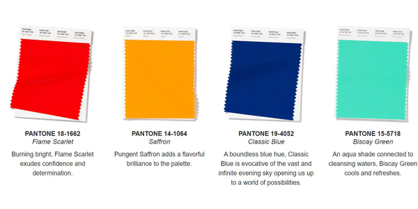
Image via Pantone
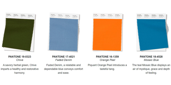
Image via Pantone
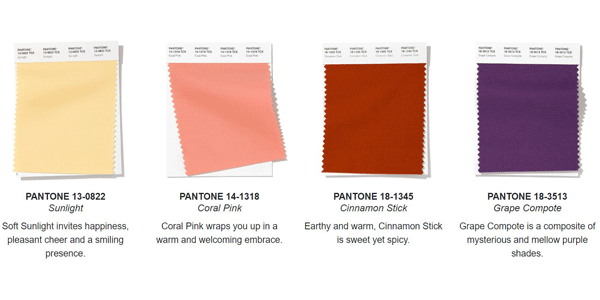
Image via Pantone
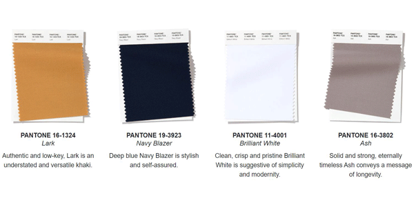
Image via Pantone